 ← All insights
Three audiences, one building
The sponsoring body needs the country to be recognised and represented with the right register. Individual exhibitors need their own frontage, product visibility and somewhere to hold a real conversation. Visitors need to understand what they are looking at within a few seconds of arriving, without reading anything.
These requirements pull against each other. A pavilion that maximises national identity tends to flatten its exhibitors; one that gives every exhibitor equal prominence stops reading as a country at all. The design problem is not decoration. It is hierarchy.
Resolve the hierarchy before the aesthetic
The workable pattern is a strict order of legibility. One national identity readable at aisle distance and above head height. Beneath it, a consistent architectural language that every exhibitor inherits — the same frontage depth, the same display grammar, the same lighting temperature. Within that, each exhibitor's own product and identity.
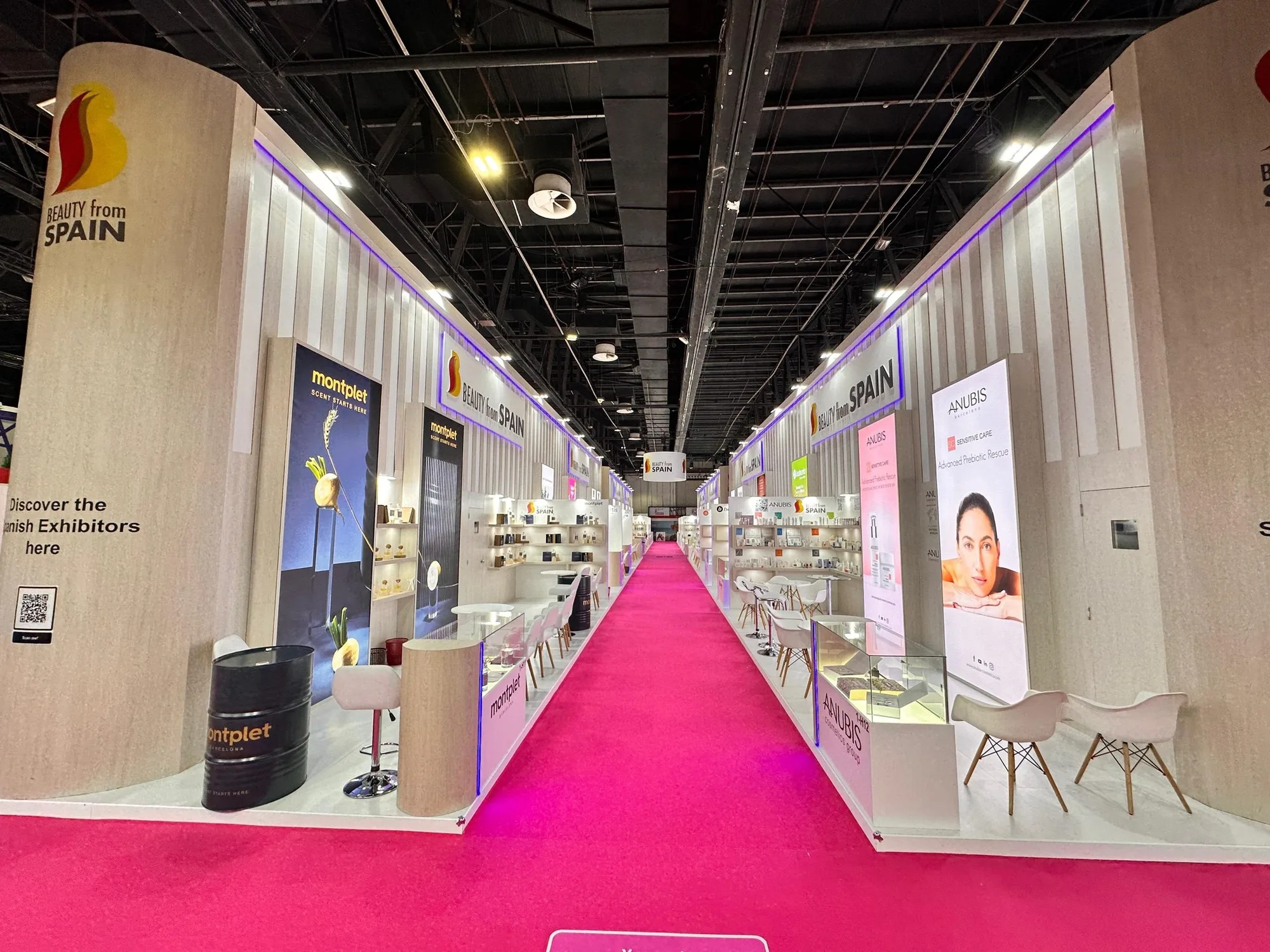
The Beauty from Spain platforms at Beautyworld Middle East show this working across successive editions. The 2018 pavilion used repeated Spain towers and illuminated product bays to create rhythm through a long linear marketplace. The 2024 edition carried the same discipline into light timber fins, rounded corner towers and a controlled white display language. Different visual language, identical structural idea: the country is the frame, the brands are the content.
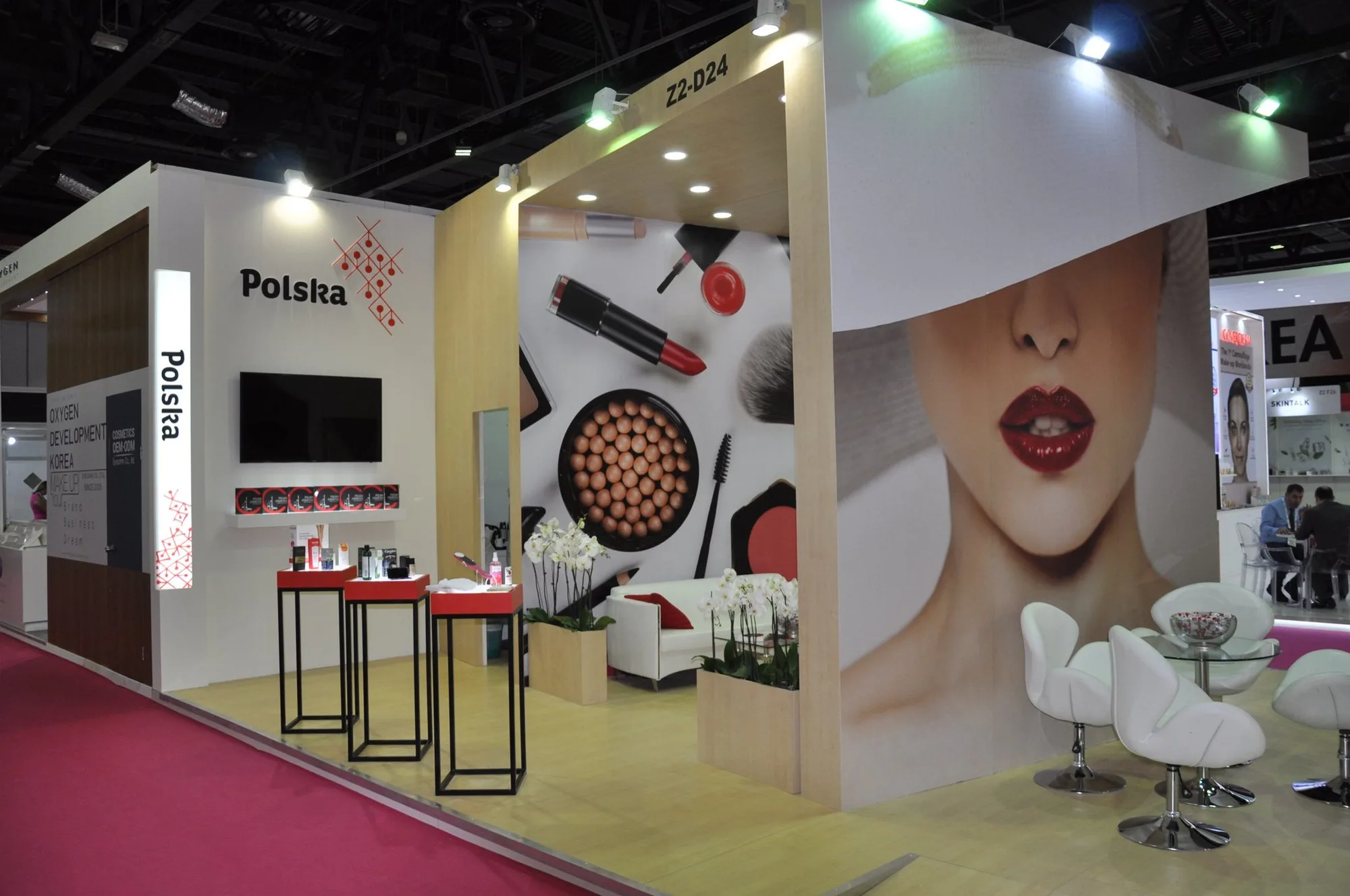
The Poland Pavilion at Beautyworld Middle East 2023 applied the same logic across 480 m², using shared wayfinding and open consultation points so that a diverse group of cosmetics exhibitors read as one platform without losing individual product stories.
Circulation is content
Visitors do not experience a floor plan. They experience a route. A pavilion with a single entrance creates a queue and a dead back corner; one with too many entrances has no sequence at all and everyone leaves from where they came in.
The practical questions are unglamorous. Where does someone stop first? What is visible from that point? How many steps before the next reason to stop? Where can two people talk without blocking the aisle? A pavilion that answers these will out-perform a more beautiful one that does not.
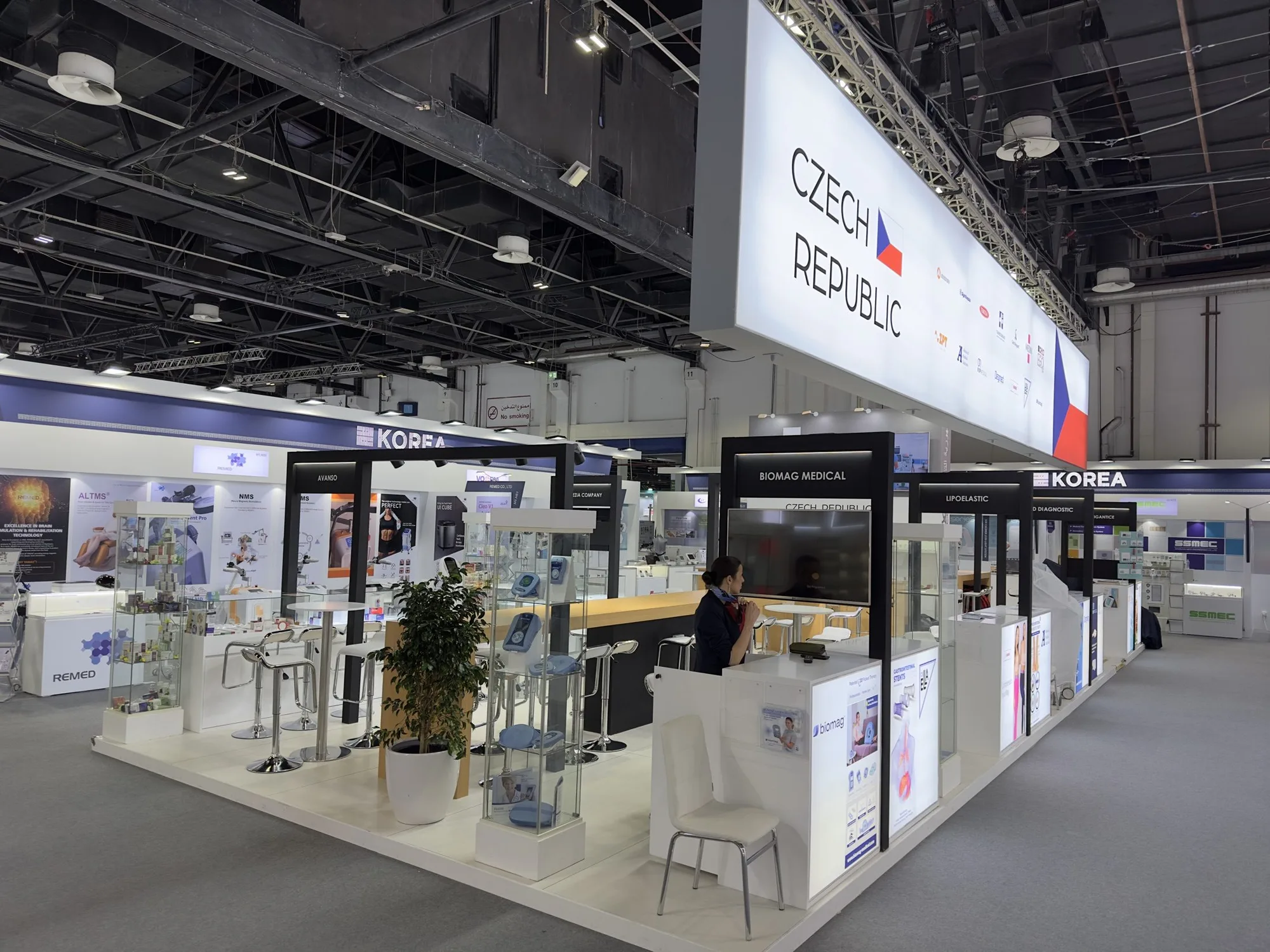
The Czech Republic Pavilion at Arab Health 2024 used a continuous illuminated fascia to establish the platform at distance, then modular display frames and a warm hospitality spine to give each exhibitor a defined place within the route.
Immersive content earns its place or it does not belong
Large-format media is the most over-specified element in pavilion design. It is justified when it does something architecture cannot — conveying scale, process or an idea with no physical object attached.
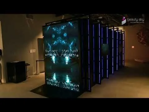
The Czech Republic Pavilion at Expo 2020 Dubai is a clear case. A multi-sided LED room turned molecular imagery into something with the spatial presence of a galaxy, giving an invisible scientific idea an immediate emotional register. The Estonia Pavilion used immersive light and spatial sequencing to connect a national digital story with moments of gathering and hospitality.
In both, the content was the argument. Where a screen is only a brand loop, a well-lit wall and a person who knows the product will out-perform it.
Settle these before design starts
How many exhibitors, and is the number final? Late additions are the most common cause of pavilion redesign.
Does every exhibitor receive an equal footprint, or is there a tiered structure? Decide it politically before it is decided spatially.
Who approves the national identity treatment, and how many approval rounds does that body require?
What happens in the pavilion beyond display — ceremonies, delegations, press moments, signings? Programme drives space more than product does.
Is there a second edition? A pavilion designed once and adapted three times is a different investment from one built to be consumed.